Introduction
The allure of day trading is undeniable. You can make small profits by entering and exiting positions at the right time, but these can quickly add up. If you want to start trading, you’re not alone-many people have taken up day trading in recent years. You’ll need a good platform, some money, and an account to get started, but that’s the easy part.
It’s very easy to become overwhelmed once you start using a trading platform. In fact, it can appear quite arcane and incomprehensible-but there is a cure for this, and it is known as chart patterns or price patterns. You can actually predict what will happen with them, but it takes a lot of practice.
In this guide, we’ll tell you know about what is day trading patterns. Patterns are part of the technical analysis discipline, and they’re very useful for any type of short-term trading—but day trading is the investment strategy that relies on them the most.
What is Day Trading Patterns?
Once you’ve mastered technical analysis, you’ll notice that certain patterns repeat themselves. To spot them, you’ll need a basic understanding of how to read a stock chart, but to truly use them, you’ll need an in-depth understanding of the patterns themselves.
We’ll go over some of the most crucial stock chart patterns for day trading. But first, we need to talk about Japanese candlesticks. Looking at these charts will be incomprehensible if you are unfamiliar with them—and if you are familiar with them, it is also useful to understand why day traders prefer this charting method.
What Are Japanese Candlesticks?
In the 18th century, a rice merchant named Muneheisa Honma invented Japanese candlesticks. Muneheisa Honma was also one of the first authors to address the topic of market psychology in his book San-en Kinsen Hiroku.
As you can see, Japanese candlesticks differ significantly from traditional bar charts. They are simply better at providing more information at a glance. A bar chart shows the closing price; a candlestick shows the open, high, and low, as well as whether the open was higher than the close.
The “wick” visible above and below the body of a candlestick is known as a shadow, and it represents the day’s high and low prices. The candle’s color indicates whether the open was higher than the close—if it was, the candle will be green; if it wasn’t, the candle will be red. The candle’s body represents the open and close—if the candle is long, there is a large difference between the two.
Are Day Trading Patterns Effective?
Sure, patterns can help you understand what’s going on, but to increase your chances of success, you should also be aware of volume, earnings releases, major economic news, and media coverage of the stock in question.
In particular, you should combine the benefits of analyzing stock chart patterns with other technical analysis tools, primarily technical indicators, which will be covered in the following section. Another important thing to remember is that these patterns do not appear out of nowhere or at random. Nothing happens in a vacuum, and when other traders notice a pattern developing, they will most likely react to it.
In essence, chart patterns become a sort of self-fulfilling prophecy—a pattern signals that people will buy, and we, and other traders, buy to profit from the increase in price. As a result, people bought, just as the pattern predicted. Even if charts are nothing more than self-fulfilling prophecies, having the know-how to identify them, as well as knowledge of the optimal entry and exit time, can lead to sizable returns.
How to Use Day Trading Patterns in Practice?
Depending on how much free time you have, we recommend starting with a couple of chart patterns. Work on recognition, confirmation through other metrics, and execution to ensure you enter and exit positions on time. If you’ve never seen Japanese candlesticks before, you should get used to them because you’ll be seeing a lot of them.
A demo account-a practice account that allows you to make trades with fictitious, virtual money-is one of the best ways to practice using day trading chart patterns. Fortunately, the vast majority of premium brokers for day trading provide them. Demo accounts are beneficial in more ways than one. They allow you to trade and get a feel for the market without risking your money, but they also allow you to become acquainted with a specific platform.
What Are Popular Day Trading Patterns in Use?
We’ll start with support and resistance lines, which will provide the framework for looking for the other patterns—and we’ll cover some of the most well-known patterns, chosen for their simplicity, reliability, or frequency.
Support and Resistance
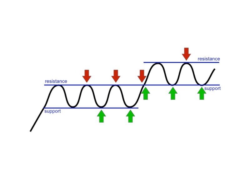
We use support and resistance lines to determine whether or not a new trend will emerge in the price of a stock. The support line is the bottom line—it tells us the price that the stock hasn’t traded below, and the resistance line is the upper line—it tells us the price that the stock hasn’t traded over. As you may have guessed, these lines are above and below the current trading price.
When a stock’s price crosses either of these lines, it’s likely that you’re witnessing the start of a breakout. However, if a stock crosses one of these lines and immediately experiences a price correction, you’re not witnessing a breakout.
If the stock price remains consistently above or below the respective lines while volume increases, this provides a much better signal. However, the most useful aspect of support and resistance is that they provide us with a simple framework in which to look for chart patterns.
Ascending Triangle
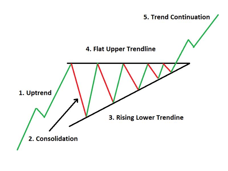
There are two more triangle charts, but let’s start with just one to keep things simple and easy to understand. The ascending triangle is a continuation pattern, which means it indicates that the current trend will continue. It is also a bullish pattern, indicating that an uptrend will continue.
Right away, you can see that the stock price has a couple of small highs, which are connected to form a small resistance line. The small lows, on the other hand, form an upward-trending diagonal trend line. As a result, the shape is a triangle, hence the name.
The narrower this pattern is, in general, the safer it is. It is riskier if it is wider, but this is easily remedied by using more complex order types, such as stop-loss orders. Keep an eye on volume, which should be declining during the triangle’s formation and then rapidly increasing when the breakout occurs.
Cup and Handle
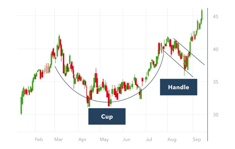
One of the most easily recognized and intuitive chart patterns is the cup and handle. It’s a continuation pattern, which means it indicates that the current trend will continue. Looking at the beginning of the chart, we can see a uniform increase in price-what is important here is that it must be accompanied by an increase in trading volume. If both elements are present, you may be seeing the start of a cup and handle pattern.
Following the initial rise, both the price and trading volume fall, forming the so-called bottom of the cup. Following that, both metrics gradually rise, followed by a small drop in both, forming the handle. Following the handle, the stock price experiences a breakout and will reach new highs.
Bullish Flag
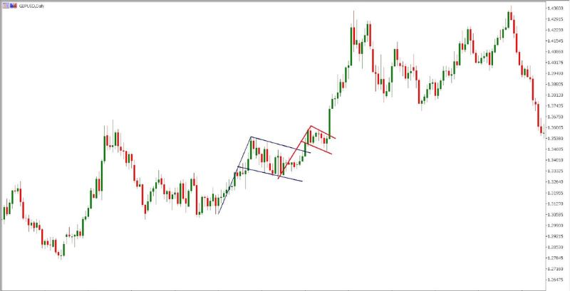
During an uptrend, the flag forms the initial sharp rise in the stock price forms the so-called flagpole. Following that, we can clearly see the consolidation period—prices vary, rising and falling slightly. Following that, a breakout occurs, and the stock price continues to rise, reaching new highs.
Trading volume is one way to test the validity of this pattern—the initial rise in the flagpole should be followed by a simultaneous rise in trading volume. The consolidation period should have an even amount of volume—but keep in mind that this does not guarantee that there will not be a significant drop in volume when compared to the flagpole. When the breakout occurs, the trading volume should quickly resume.
Engulfing Candles
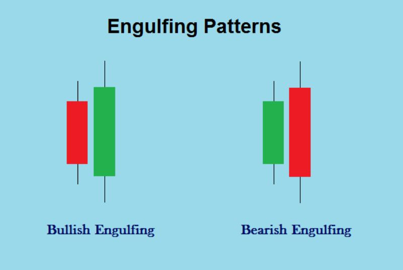
The engulfing candle chart pattern indicates a reversal of the current trend. It’s easy to spot and will probably catch your eye when you’re looking at a chart even if you’re not aware of it. Unlike the majority of the chart patterns on this list, this one has only two candles.
The first thing that stands out is the significant size difference between the two candles—this is the key to understanding the concept of this pattern. During a clear downtrend, the bullish engulfing candle occurs—after a single red or hollow candle, the next is much larger and opens at the same or a lower price than the previous close.
Head and Shoulders
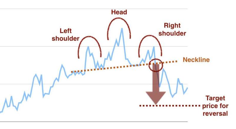
The head and shoulders pattern is a well-known stock chart pattern that is thought to be one of the more reliable indicators of a trend reversal. As an added bonus, like a few of the patterns we’ll go over below, this one has a distinct shape that is easy to identify.
A head and shoulders pattern is a reversal pattern that occurs during an uptrend. As such, it indicates that the current price rally is coming to an end and that a bearish trend is about to begin.
The head and shoulders pattern occurs when a stock in an uptrend reaches a new high, only to fall slightly and reach an even higher price, which is then followed by a drop and another rise that mimics the first. Following the second rise, the stock breaches the support line, indicating the emergence of a downtrend.
Hanging Man and Hammer
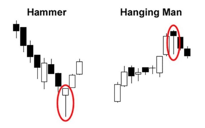
Hammer chart patterns are distinct from the majority of the others on this list in that they can be identified by looking at a single candlestick. Of course, you must pay attention to the price movements that precede that candle-along with a couple of other requirements. The hanging man pattern as seen in the image above, has a hammer-like candle at the top. This is a bearish short-term pattern, but there is also an inverted, bullish version known as “the hammer.”
The body of the candle is small in both of these patterns, while the shadow on the bottom is quite long. The actual bodies of the candles are very close to the highs of the day, and the shadows should be at least twice as long as the body. The longer the shadow, the more likely the chart pattern will play out—and high trading volume is another plus.
A hammer appears during a downtrend and indicates that it is about to end. Similarly, the hanging man occurs during an uptrend, indicating that the trend is about to reverse. These are both reversal patterns, one bullish and one bearish. Because they are both reversal patterns, they provide strong signals for either buying or selling the stock.
Double Tops
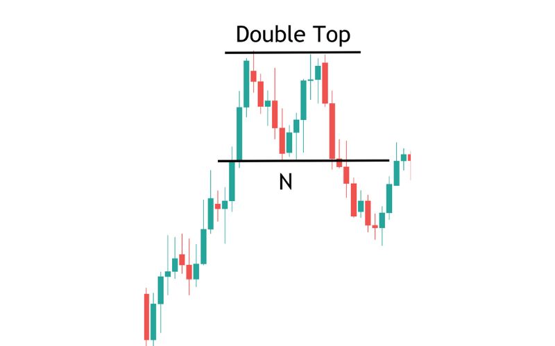
A double top is a reversal pattern that indicates the start of a bearish trend, also known as a downtrend. It’s easy to spot, and it usually indicates the start of a long-lasting trend. The double top, which appears in the shape of the letter M, is another simple chart pattern. A true double top requires the price to reach the same high twice, with a small drop in between.
Look at the stock’s trading volume after the price drops following the second high for final confirmation that this chart pattern is valid—if the volume continues to rise while the price drops, the pattern is valid.
Double Bottoms
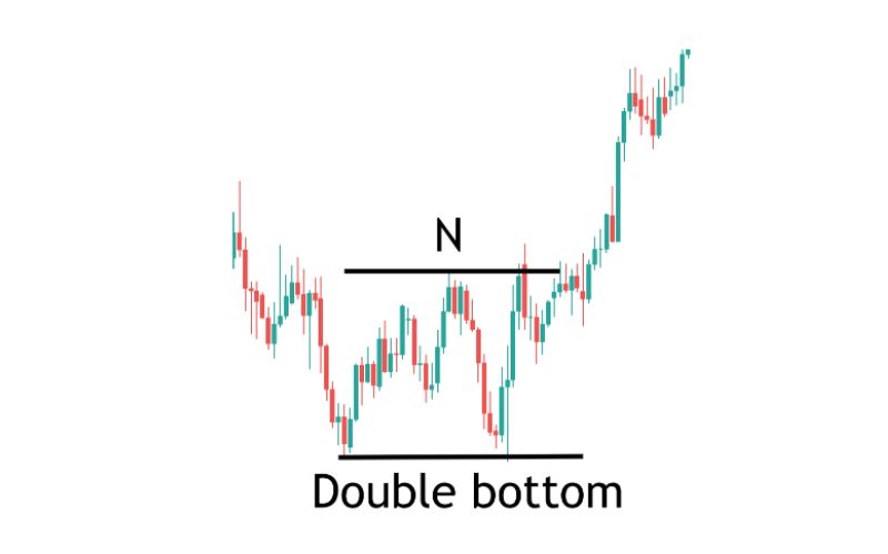
A double bottom is a reversal pattern that indicates that the current trend is about to end. A double bottom is one of the simplest patterns to recognize—it resembles the letter W and is the inverse of a double top. In the case of the double bottom, it indicates that the stock is about to enter an uptrend or price increase.
A double bottom occurs when the price of a stock falls to the same level twice in a short period of time. A good rule of thumb is that the first drop should be 10% to 20%, and the second drop should be roughly the same—no more than 3 or 4% different from the first low.
What is Day Trading Patterns: Frequently Asked Questions
- Where can you find day trading candlestick charts?
Day traders can access candlestick charts in a variety of ways. Many brokerages, as well as websites like TradingView and Yahoo Finance, provide these charts. Try a few and see which one you prefer, but make sure to use live charts that update prices in real time.
- What charts should you use when trading forex or cryptocurrencies during the day?
Because day-trading strategies are not limited to a single type of security, the guidelines for stock day traders are the same as those for forex or cryptocurrency traders. Of course, stocks behave differently than Bitcoin, which in turn behaves differently than the USD/JPY pair. Before assuming that your previous success will carry over, carefully test a strategy in new markets.
- In day trading, what patterns should I look for?
When a new trader can successfully trade these patterns, they are frequently on their way to becoming a consistently profitable trader. Bullish Pennant, Bull Flag, and Rising Wedge are the three most common bullish continuation patterns.
- What is the most common trading pattern?
Triangles are among the most common chart patterns used in technical analysis because they occur more frequently than other patterns. Triangles are classified into three types: symmetrical triangles, ascending triangles, and descending triangles.
- What are patterns in day trading?
Pattern day traders may trade different types of securities, including stock options and short sales. Any type of trade will be accounted for, in terms of this designation, as long as they occur on the same day. Pattern Day Trading is limited to stock and equity options trades.
Conclusion
Chart patterns are extremely important for day trading-it is entirely appropriate to refer to them as your bread and butter. Although it may appear to be a lot to take in at first, recognizing patterns and making decisions based on them will become second nature with practice.
Fortunately, unlike many investing topics, this one is more visual and intuitive-no overly complex formulas, no number crunching-but plenty of candles and interesting shapes. You’ll be well on your way to success if you study hard and get a demo account.

